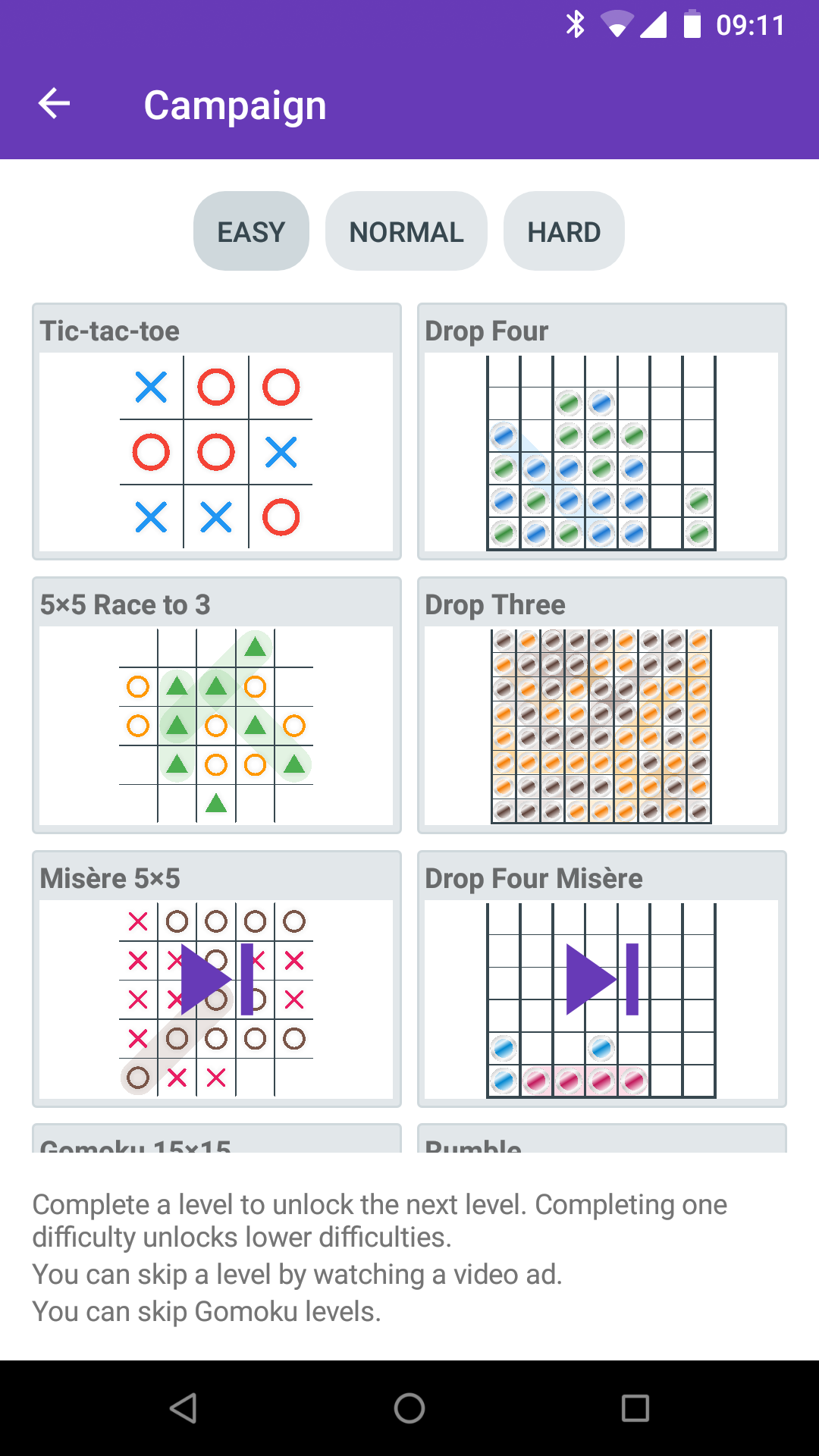
Version 0.10 brings a single player progression mode called “Campaign”.
This is part of my attempt to try and guide a player through the various game options that are available in Tic-tac-toe Collection. There are currently 12 different levels that between them showcase everything available.
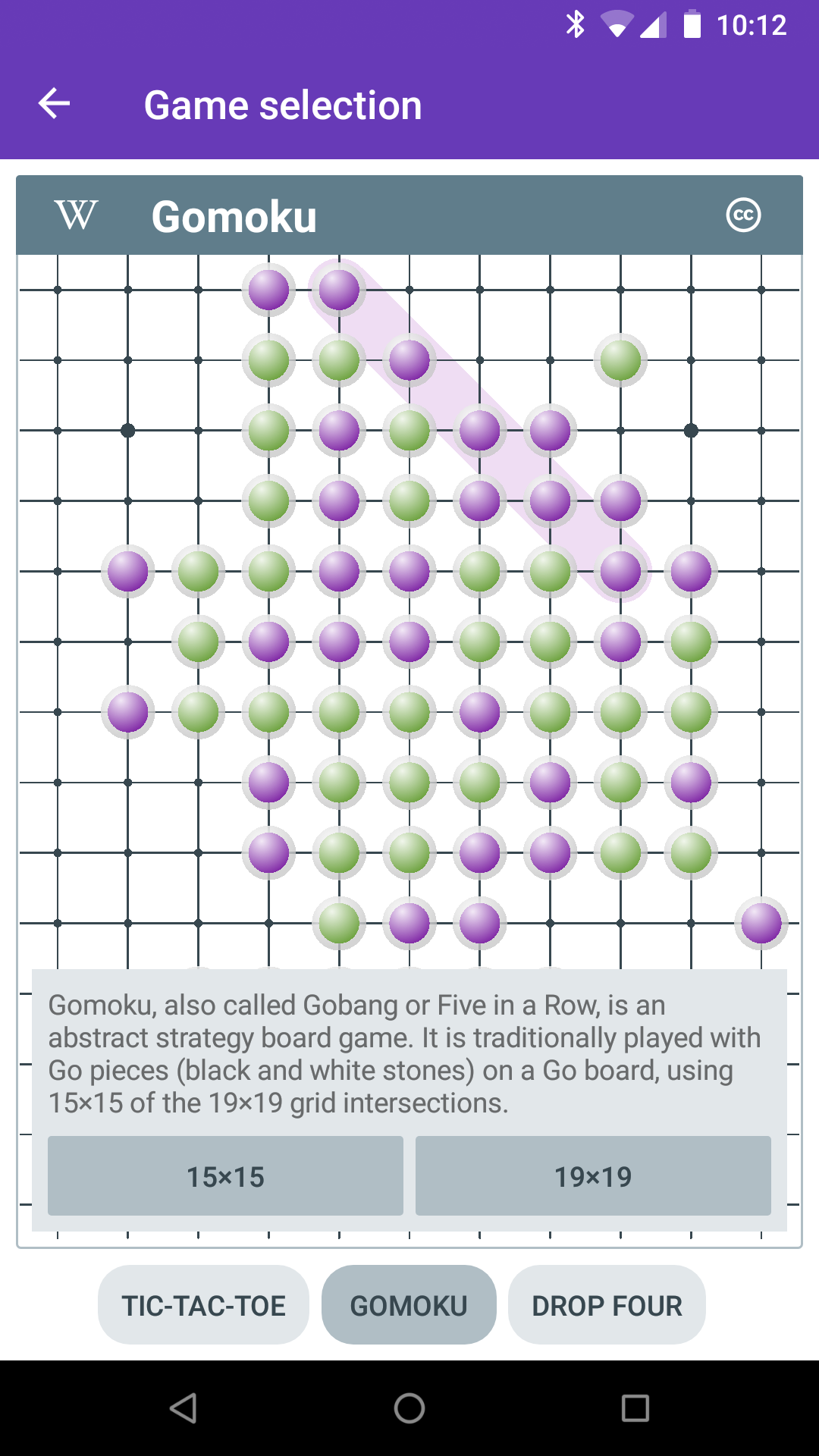
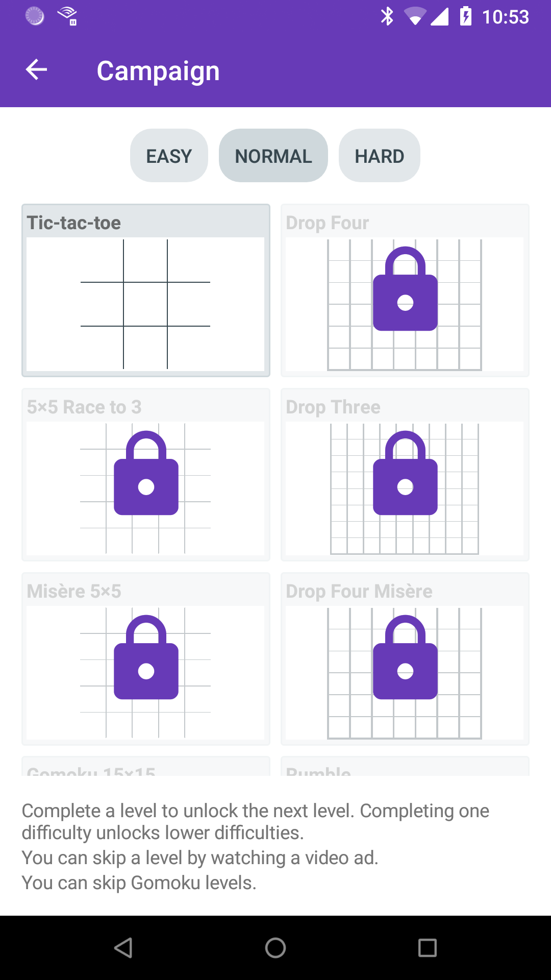
In general, you must complete a level to play the next one, however Gomoku is currently skippable since at the moment since it’s only nice to play on a tablet. There are three difficulties, which just correspond to the three AI levels, and completing a level counts as completing the lower difficulty version of that level.
This also marks my first use of rewarded video ads. When you fail a level, you have the option of skipping to the next one after watching a rewarded ad.
0.9.2 doesn’t contain any new features, but does contain a lot of optimizations. Here is more detail on some of them.
Tic-tac-toe Collection is built using Xamarin Forms. This post assumes familiarity with Xamarin, Xamarin Forms and .NET. I do have another post planned with more detail on these steps for those less familiar.
Firstly, I enabled Proguard, a tool for stripping out unused code at the Java byte code level. Doing this for Xamarin is a bit weird because the version of Proguard you get by default does not work if you are targeting Android 7.0 or newer. A Nuget package is recommended but that didn’t work for me either due to some path issues. So I just extracted the jar and specified the path manually.
I grabbed an example Proguard config file off the internet, added some extra bits I found elsewhere for Google Ads, and tried to run it. I worked through the errors about missing things, adding to the config file as I went. On the whole, actually straightforward.
The next step was to enable “link all” in the Xamarin linker settings, to remove unused code at the .NET level. This time however, instead of immediately excluding things from linking that caused problems, I realised I could actually reduce the number of things only referenced using reflection.
By default Xamarin Forms uses reflection heavily when data binding. This can be largely avoided by using compiled bindings. To use it you need to do two things: firstly, enable XAML compilation (which you should have been using already); secondly, add appropriate `x:DataType` properties to your XAML.
This underused feature allows the compiler to generate strongly typed bindings based on the type you specify.
After doing that, the only things left that the linker was breaking was types used in JSON serialization, which were easily fixed.
The final thing I did was to replace Autofac. Autofac was the first IoC container I was introduced to and has been my default choice, pretty much without any thought. However I came across this chart of IoC performance and realised I was not using any of the clever features that justified Autofac and so, switched to LightInject.
Enabling Proguard and the linker cut the APK size down from about 32MB to 22MB. The improvements from the compiled bindings and Autofac changes are harder to measure.
The most notable improvement is cutting in half the time to go from the main screen to the game screen directly, and all of the steps will have helped.
Very few overt changes, just lots of optimizations. Some specifics include:
- Reduced app size by about 25%.
- Made more of the game board loadable in the background.
- Made screen transitions more efficient.
- Added a fade-out to page transitions, mainly to hide the unfortunate pause if you go straight from the main menu into game without doing anything else.
Just some minor startup improvements.
- Improved actual startup time by making some things run in parallel that were previously serial.
- Improved apparent startup time by transitioning from the splash screen to a loading screen sooner.
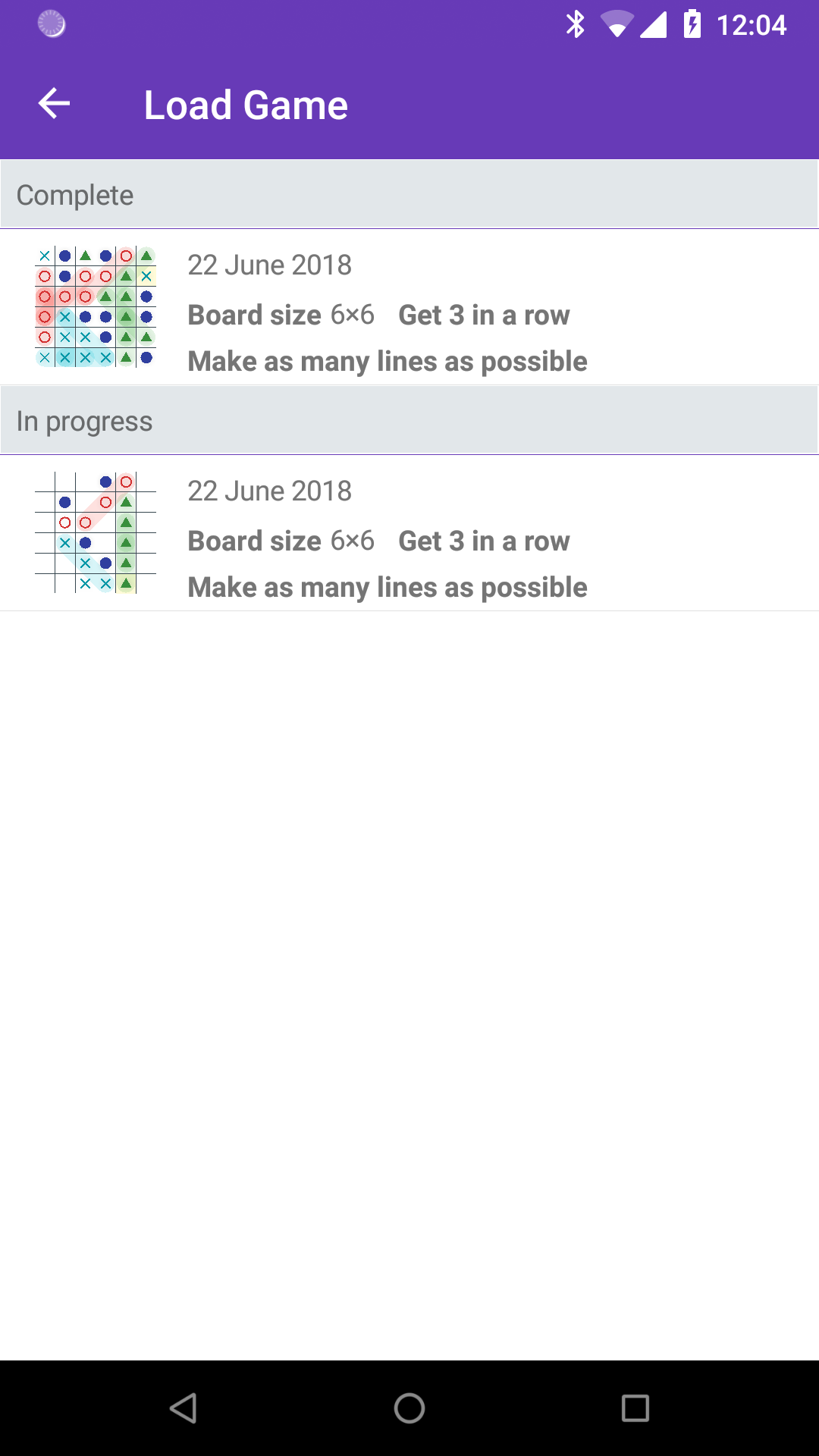
The game renderer has been massively overhauled, directly leading to the following:
- New animations for playing pieces for Drop Four and Gomoku.
- New winline drawing animation.
- Scrubbing backwards through history now animated.
- New piece option: filled triangle.
- Saved games no longer use pre-generated images.
Version 0.9 includes one big feature you can’t see, but it enables other little features you can see.
The renderer for the actual game has been rewritten. The first one was based on some assumptions that no longer hold, was rather complicated, and most importantly was slow. The new version is far more flexible and quicker.
To get the game up and running sooner, the original renderer created native UI elements for each cell. For 3×3 this was fine. For 19×19 this was terrible, and could take 20 seconds on a slow device. This also meant rendering pieces outside of their cells was difficult (and in the future rendering something that was not a rectangular grid would be a challenge). Now, the whole board is one thing and layout is handled internally.
The first little feature this enables is cool little piece placement animations. The video shows pieces dropping in Drop 4. Gomoku also has its own, which I’ll let you discover.
The second little feature is actually the one that drove me to do this. You may notice when playing on a large grid there still is a (much shorter) loading phase when starting a game. This is not actually the renderer, but the UI controls for selecting elements (which for various reasons will probably remain separate). If the game was non-interactive, the loading would not be there at all. And you can now see that in action when loading a saved game. The new renderer is fast enough (milliseconds) that I can render arbitrary game states anywhere in the UI and the load game screen now takes advantage of this (previously saving a game also saved an image of the game just so it could be shown on the game screen).
The Easy AI and Hard AI now work with Drop Four. Apparently they were previously getting confused.
