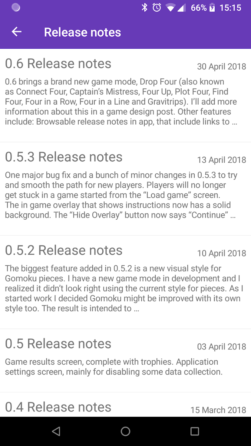
0.6 brings a brand new game mode, Drop Four (also known as Connect Four, Captain’s Mistress, Four Up, Plot Four, Find Four, Four in a Row, Four in a Line and Gravitrips). I’ll add more information about this in a game design post. Other features include:
- Browsable release notes in app, that include links to the blog.
- Back and forward buttons in the game history.
- In game action buttons now use icons.
- Previous move highlight now fills the square.
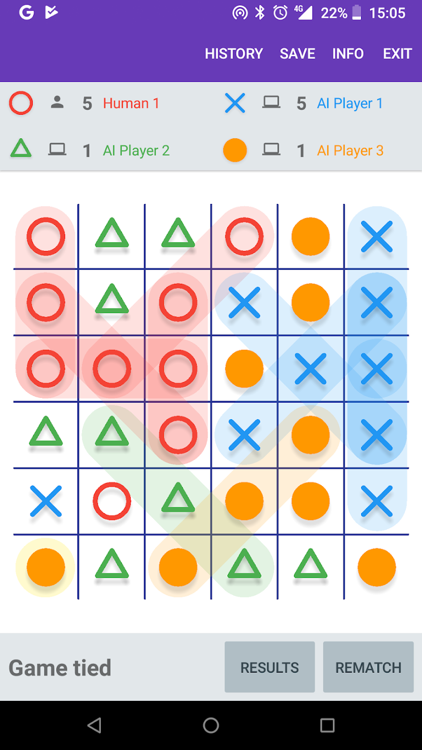
One of the key things I want to achieve with Tic-tac-toe Collection is fun game modes for more than two players. There are some obstacles to overcome.
The first, surprisingly enough, is how to refer to it. My first instinct is “multiplayer”, but when used in the context of, say, an app store description for a tic-tac-toe game, that just sounds like two player (and probably implies over the internet).
The second is more interesting. There is not a lot of information about tic-tac-toe-like games with more than two players. In fact, in academia in general, there is very little about any kind of game with more than two players.
If you look at the Wikipedia page for Tic-tac-toe, Connect Four or Gomoku (or Chess or Backgammon for that matter) there are sections about the mathematics of the game. Does one of the players have an advantage? Is the game “solved”? If you take the most well known similar game I can think of that regularly has more than two players, Chinese checkers, there is nothing of the sort.
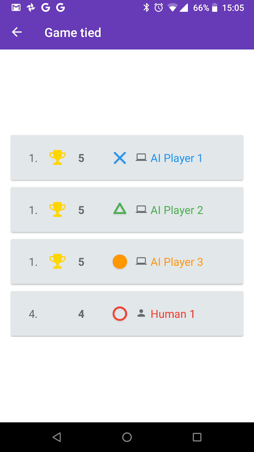
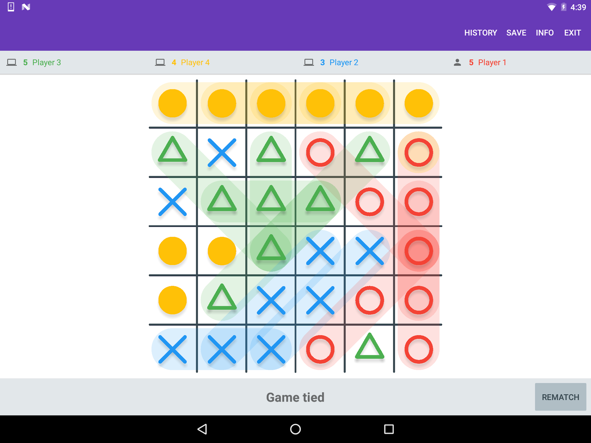
So I figured I would just make something up, and see what happened. My first attempt is the Rumble game mode. This is a tic-tac-toe variant with two key differences, a larger board, and a point-per-line (playing until the game is full with the highest score winning). The larger board was the first step, since 3×3 is already a forced draw for two players and more would just make it worse. The point-per-line idea came about since with a larger board, it was still too easy for the first player to get a line.
That is to say, it is normally too easy for the first player to get a line, but not always. And it is for the same reason as why games with more than two players are taken less seriously - the possibility of collusion changes things drastically. If one of the players is not playing to win, it is very difficult to determine a useful strategy. Despite that, there is one multiplayer game that is taken seriously that features this as a mechanic: Diplomacy.
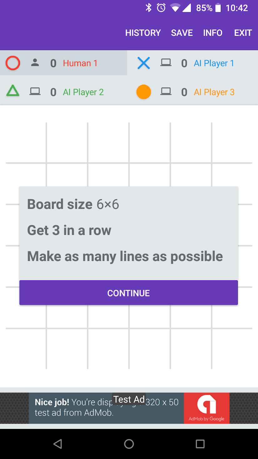
I recently watched someone play Tic-tac-toe collection for the first time and noticed some issues with the new player experience. When the app loaded they immediately pressed the “Play Now” button on the Rumble announcement (without reading anything). Next they tried to tap somewhere to play, despite the fact that the instruction overlay was visible and it was the AI’s turn. Then they made a line and were confused about why the game continued. After working things out and completing the game, they wanted to see their results (since they weren’t first and this was a multiplayer game) but didn’t immediately work out how.
This is all a little disheartening, but not surprising. It goes to show the importance of user testing. Version 0.5.3 (which is currently in beta) includes fixes for some of these issues.
There is still more to do. I think having the first thing the player does is play a game on an large grid, with many players and that doesn’t end when someone gets a line is not ideal. On the other hand I do want to push the fact that the app does far more than just simple Tic-tac-toe.
One major bug fix and a bunch of minor changes in 0.5.3 to try and smooth the path for new players.
- Players will no longer get stuck in a game started from the “Load game” screen.
- The in game overlay that shows instructions now has a solid background. The “Hide Overlay” button now says “Continue” and is more prominent.
- Trying to play when it is the AIs turn shows an alert telling you.
- Default player names are now chosen based on whether the player is human or an AI.
- Starting a “quick game” (currently only possible from the Rumble announcement) does not randomise player order, so the human player always goes first.
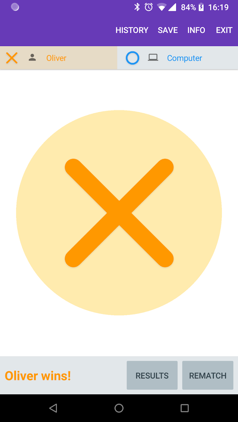
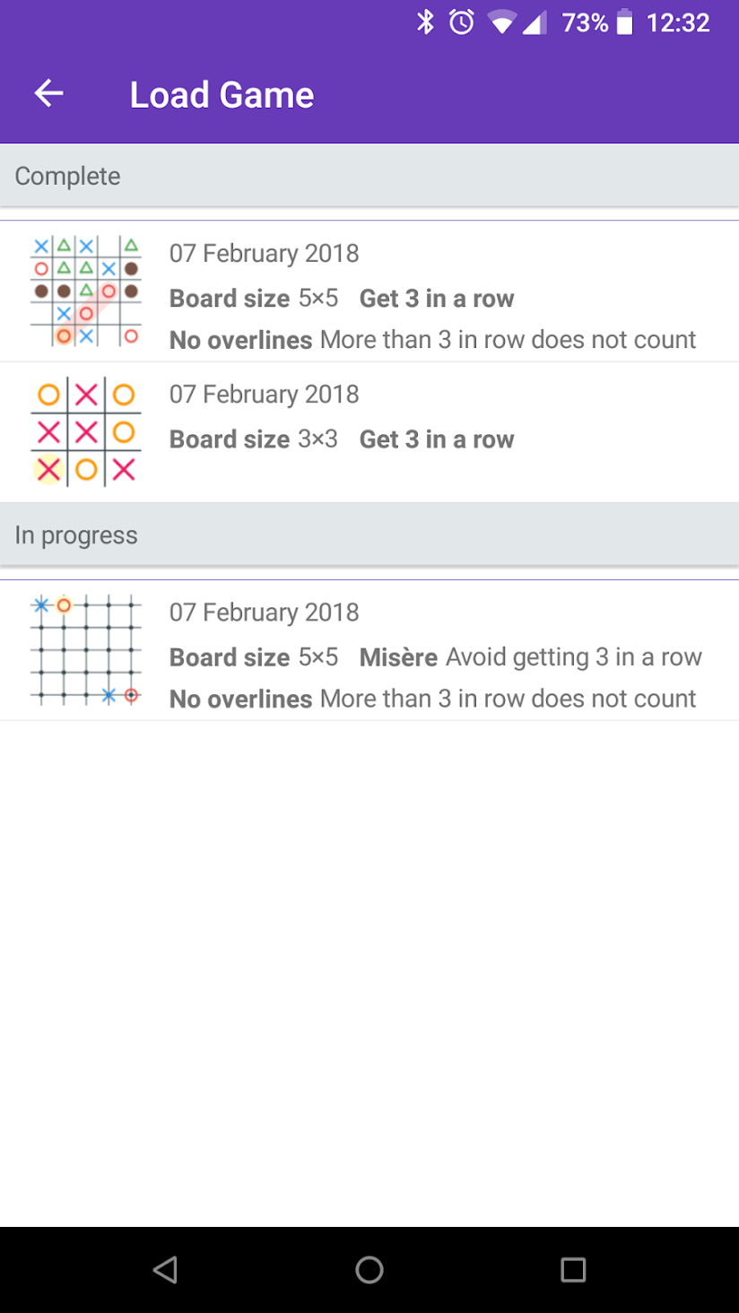
One of my goals with Tic-tac-toe Collection is to provide the user with lots of options. Some examples are board configurations and rules. A big problem with this is that most combinations don’t result in fun games.
Although I want these options to be available, I don’t want people choosing these settings by default since they will have rather pointless games. Some are obvious: a 1×1 grid for instance is pretty silly. There are some you might not realise immediately but make sense when you think about it, like more than two players on a 3×3 grid is unlikely to ever have a winner.
After that, it gets hazy. For instance when playing with two players and misère enabled (creating a line loses) on a board with an even width and height, the player going second can trivially force a win. For people who want to play seriously, this is bad. But for a casual player this is probably not a problem. How to force the win isn’t that obvious, and it’s at least as interesting as standard Tic-tac-toe.
Most of the games are probably a force win for one of the players. But that doesn’t mean the game should be disregarded. After all, 19×19 Gomoku is unlikely to ever be “solved” even though that too is probably a force win.
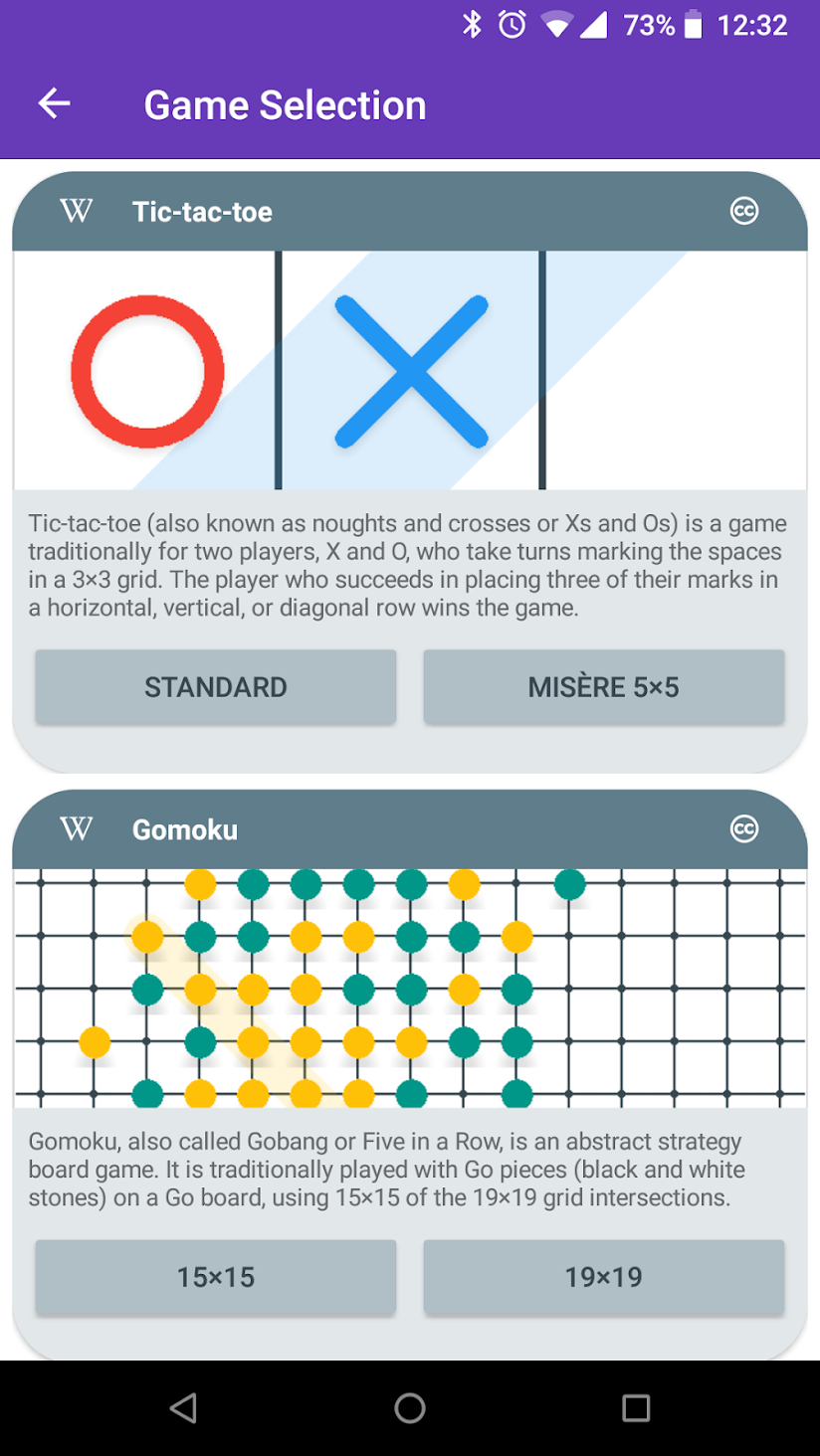
My solution is to try and highlight settings options that are popular (Standard Tic-tac-toe for example) or interesting (Rumble 6×6). For the moment that works, but over time as the number of good options increases, I’ll have to come up with something better…
The biggest feature added in 0.5.2 is a new visual style for Gomoku pieces.
I have a new game mode in development and I realized it didn’t look right using the current style for pieces. As I started work I decided Gomoku might be improved with its own style too. The result is intended to look more like traditional Gomoku stones.
